
What?
Personas
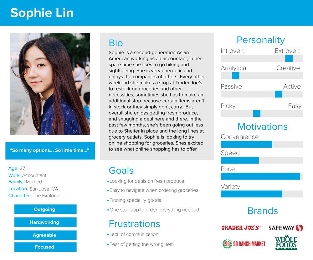
Personas were created to help me get a better understanding of who I was designing this app for. How could I cater to their needs? And how could I provide them with a better user experience.

this is a case study Weee! Is an online grocery app that sells and delivers affordable produce in the Bay Area. They are looking to grow their customer base by offering unique Asian goods, which are typically not found in local grocery stores. However their app struggles to deliver an enjoyable experience, as its hard and confusing to navigate.
Case Study, Redesign, User Research, Prototyping, Visual Design
July - August 2021
Weee! wants to expand their business and reach a broader audience, but their current app has too much going on. Some user's would feel overwhelmed when they first launch the app and would leave it right away. There's no visual hierarchy, which makes the app hard to navigate from one section to the next. User's who are accustomed to mainstream apps may find it a hassle to make a purchase from Weee!
Redesign and restructure the current app layout to provide a better user experience. Online shopping focuses on making a purchase seamless. User's should be able to find what they want with ease, through images or a search bar. And finally making their way to the cart to checkout.

In a survey about grocery shopping online, 42 participants were asked a series of questions. In the findings, the average age of users was in their 30’s. A majority of users spend an average of 50 dollars or more a week on groceries and have tried a variety of online services. 88% of participants have used Amazon as their go-to online service for groceries. Many agreed that online shopping is really convenient as it allowed for a wider selection of goods. The bonus part that many enjoyed was the free shipping or next day delivery.

Personas were created to help me get a better understanding of who I was designing this app for. How could I cater to their needs? And how could I provide them with a better user experience.
Users have a few routes when it comes to searching for groceries, the fastest way is inputting the items they are looking for or searching through categories. And finally, recommendations and featured items are another way to entice users to new items. Online shopping is pretty much streamlined with images and a straight forward task of searching and adding to the cart.

Some early problems encountered in the Weee! App is where does the user first start? When the app is first launched the user is greeted with 2 large promotional banners followed by the category section. The search bar and delivery options are lost in this setup, as it blends into the header. These are core features that help with a flawless experience when it comes down to hunting down items or figuring out the delivery times. In my survey, many agreed that shopping online for groceries was convenient, and I believe that contributes to the layout of the app. If it's easy to navigate, users will have a positive experience and if it’s hard and confusing users will get frustrated.


I tested the Weee! app with a few friends who have ordered online groceries from Instacart and Amazon in the past. They found Weee! to be a little foreign when exploring the layout, there was no solid branding that represented who they are, an over amount of information on the home page, and the lack of visual hierarchy. But even with these flaws, Weee! was different, it carried a large selection of Asian specialty goods, which aren’t available on Instacart or Amazon.
Examining similar apps that user's use on a daily basis when shopping for groceries.
Instacart is a grocery delivery service in the US and Canada. It's layout is very minimal and simple, user's aren't overwhelmed when they open the app. They offer a large variety of shops that users can purchase groceries from.

Amazon is known for selling a large variety of items and groceries aren't something new. Groceries can be purchased in their app, under Amazon Fresh tab. It's also broken down similar to Instacart, it is straight forward and easy to navigate.

Once I figured out the flow, I worked on lo-fi wireframes and mapped it out to help give me a better understanding of how a user would use this app.


Improving user's experience in using Weee! Mobile App

With the restructured layout, user's can easily find what they need and get past all the clutter.

Check-Out has been reworked, making the user experience much more intuitive.

The review section has been merged with the profile, now user's can keep track of their posts and read up on reviews.

The new shopping experience.


In this process, I had to think about how the users would use this app, and how do I get a wider audience to try Weee!? I redesigned the app with the idea of making it easier to navigate, a cleaner interface, and a more defined look that better represents Weee! I divided up the sections, and restructured the layout, by taking into consideration the feedback I’ve gotten from my survey and interviews. This made the user experience much more intuitive and feels more up to date in comparison with Amazon and Instacart. In taking these steps in redesigning the app, it feels more approachable after showing the end results to some users. Through additional testing, user’s liked how it was less cluttered on the home page, easier to add items to the cart, the integration of reviews in the profile section was a nice touch also.