Weee!

Mobile App Redesign

Online B2C grocery app that sells and delivers Asian specialty goods.

Specificiations

Overview

Weee! Is an online grocery app that sells and delivers affordable produce in the Bay Area. They are looking to grow their customer base by offering unique Asian goods, which are typically not found in local grocery stores. However their app struggles to deliver an enjoyable experience, as its hard and confusing to navigate.

Responsibilities & Tools

User Research, Prototyping, UI Design, Figma, Photoshop, Freelance

January - March 2020

Conclusion

The Solution

Examine user behaviors and redesign the current layout of the Weee! app based on findings. The online shopping experience should be seamless and enjoyable. User's will be able to find what they are looking for and easily complete their purchases.

Shopping

"Time to restock!"

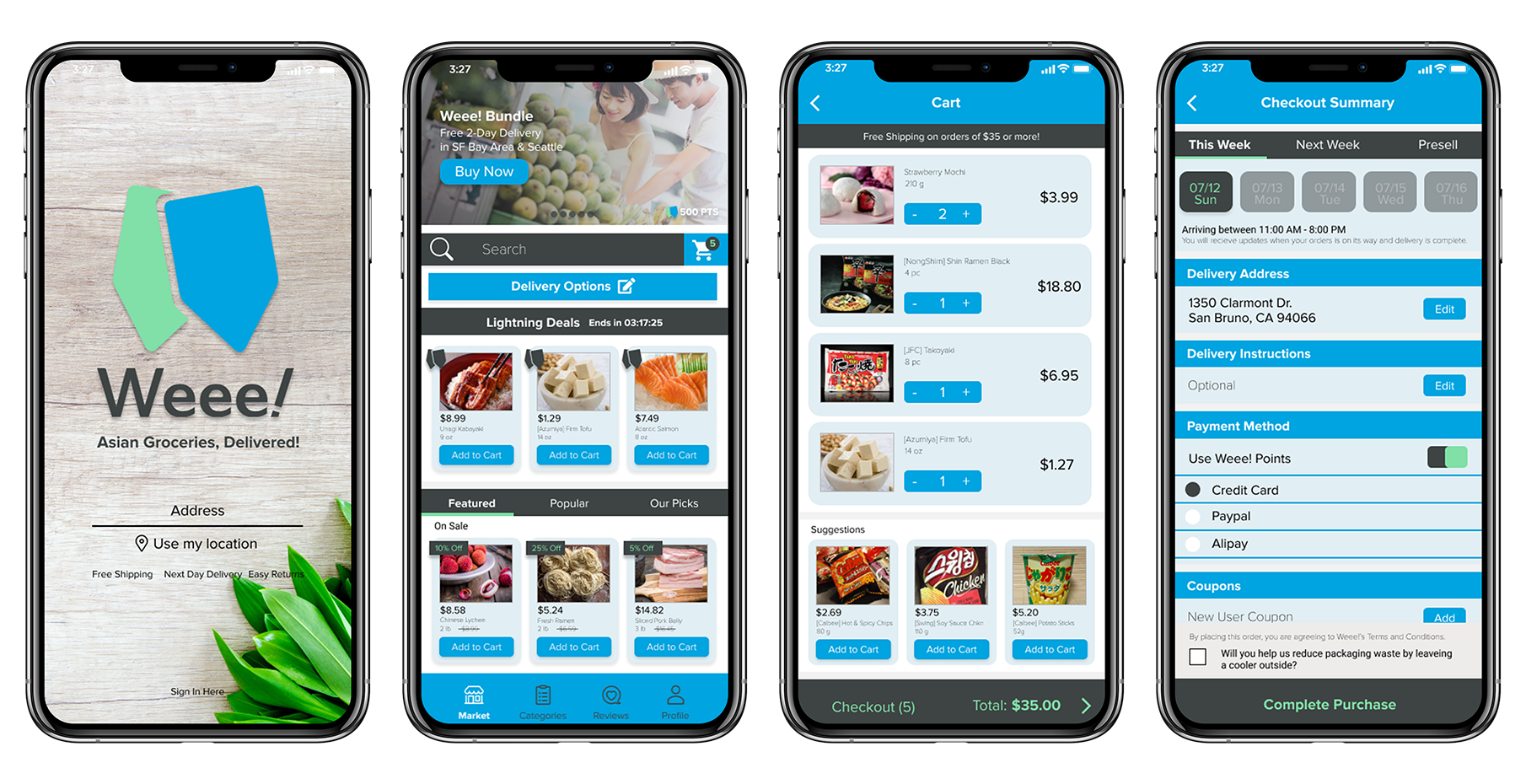
Weee! wants to expand their business and reach a broader audience, but their current app has too much going on. Some user's would feel overwhelmed when they first launch the app and would leave it right away. There's no visual hierarchy, which makes the app hard to navigate from one section to the next. User's who are accustomed to mainstream apps may find it a hassle to make a purchase from Weee!

Weee! Redesign Objectives
  • Reorganize layout and create a visual hierarchy.
  • Examine pain points and improve usability.
User Research

Survey Studies

In a survey about grocery shopping online, 42 participants were asked a series of questions. In the findings, the average age of users was in their 30’s. A majority of users spend an average of 50 dollars or more a week on groceries and have tried a variety of online services. 88% of participants have used Amazon as their go-to online service for groceries. Many agreed that online shopping is really convenient as it allowed for a wider selection of goods. The bonus part that many enjoyed was the free shipping or next day delivery.

Survey Results

App Analyst

Some early problems encountered in the Weee! App is where does the user first start? When the app is first launched the user is greeted with 2 large promotional banners followed by the category section. The search bar and delivery options are lost in this setup, as it blends into the header. These are core features that help with a flawless experience when it comes down to hunting down items or figuring out the delivery times. In my survey, many agreed that shopping online for groceries was convenient, and I believe that contributes to the layout of the app. If it's easy to navigate, users will have a positive experience and if it’s hard and confusing users will get frustrated. Additional issues that the user's experienced when using Weee! are some of the button placements, such as the quick add option located in the cart area. User's would click the add button and realize it added the item that was behind it. The checkout area user's felt could be restructured as the overall flow and steps felt out of place when comparing to other more streamlined apps.

App Map

So how does this app work? In order to get a better understanding, I created a app map and listed all its function from the main to the subs.

Interview Insights

I tested the Weee! app with a few friends who have ordered online groceries from Instacart and Amazon in the past. They found Weee! to be a little foreign when exploring the layout, there was no solid branding that represented who they are, an over amount of information on the home page, and the lack of visual hierarchy. But even with these flaws, Weee! was different, it carried a large selection of Asian specialty goods, which aren’t available on Instacart or Amazon.

  • Difficult to navigate through categories section.
  • Post option could be better utilized with product info.
  • Search feature is overlooked due to invasive ads.
  • Quick add button, adds the wrong items to cart.
  • Overwhelming layout, no visual hierarchy.

User Flow

So how does the user use Weee!? I created a user flow and listed outa possible scenario. The main goal of the app is to provide a online service, where user's can easily find what groceries they need, have them ordered and delivered.

Competitive Analysis

Examining similar apps that user's use on a daily basis when shopping for groceries.

  • Apps that are streamlined makes shopping easy.
  • Similar item suggestions at checkout.
instacart

Instacart is a grocery delivery service in the US and Canada. It's layout is very minimal and simple, user's aren't overwhelmed when they open the app. They offer a large variety of shops that users can purchase groceries from.

Features: Search, Quick add, Categories, Simple
Amazon

Amazon is known for selling a large variety of items and groceries aren't something new. Groceries can be purchased in their app, under Amazon Fresh tab. It's also broken down similar to Instacart, it is straight forward and easy to navigate.

Features: Search, Suggestions, Photos, Share, Reviews, Ratings, Categories

Personas

Personas were created to help me get a better understanding of who I was designing this app for. How could I cater to their needs? And how could I provide them with a better user experience.

Ideation

Lo-Fidelity Wireframes

I decided to focus on the core functions of the app, and created lo-fi wireframes based off my research, this gave me a better understanding of what the core goals were for the end users.

WEEE! MOBILE APP

Final Design

Improving the B2C user experience in using Weee! Mobile App

visualize

Hi-Fidelity Wireframes

With the restructured layout, user's can easily find what they need and get past all the clutter. Check-Out has been reworked, making the user experience much more intuitive.

My thoughts

Reflection

In this process, I had to think about how the users would use this app, and how do I get a wider audience to try Weee!? I redesigned the app with the idea of making it easier to navigate, a cleaner interface, and a more defined look that better represents Weee! I divided up the sections, and restructured the layout, by taking into consideration the feedback I’ve gotten from my survey and interviews. This made the user experience much more intuitive and feels more up to date in comparison with Amazon and Instacart. In taking these steps in redesigning the app, it feels more approachable after showing the end results to some users. Through additional testing, user’s liked how it was less cluttered on the home page, easier to add items to the cart, the integration of reviews in the profile section was a nice touch also.